What happened the last time someone said: That color looks good on you!
I’ll tell you what happened. You bought another shirt, or an accessory or makeup in that color. Heck, you might’ve even bought your next car in that color. The right color (or combination of) becomes a signature, signaling from a distance that you’re coming and that you’ll get noticed when you get there.
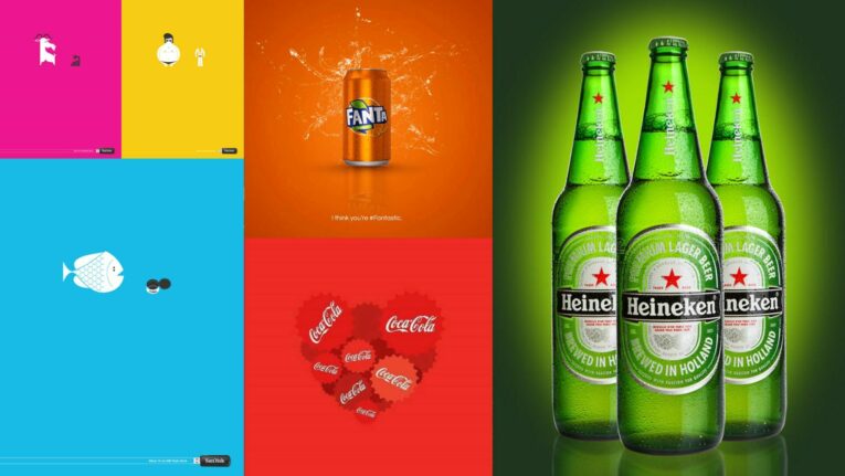
Color has the power to do the same thing for brands. A quick scroll through the Instagram grids of big brands, and you’ll see it, bold and clear. Coca-Cola? Radiantly red. Pepsi? Blatantly blue. We happen to have an affinity for Jones Dairy Farm, where the scheme is green.
Here’s why color plays such a role in marketing communications, and why you should give it the credit it deserves.
It Has Superpowers
It evokes, invigorates, brightens moods and can leave an indelible impression. Harness it to grab attention, tell a story and drive decisions.
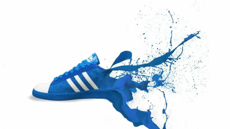
It Has Stopping Power
Whether it’s stopping the scroll or stopping traffic with a billboard that catches your eye, color is the name of the game. A big, bold swath of color is arresting and can immediately connect a consumer to your brand.
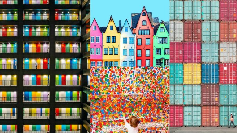
Color Pops
Advertising that grabs you from the screen—making a 2D image somehow seem 3D—compels you to click. It also sticks with you so you remember it when that same visual language pops up later on a shelf.
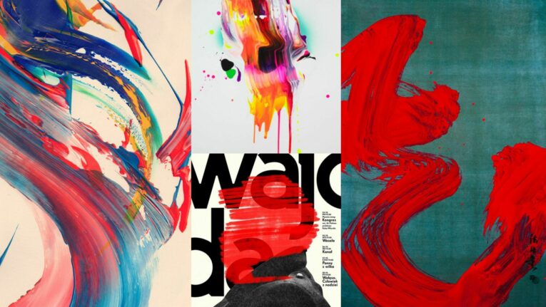
It's Artistic
Good design is just good design. The talented creatives at S/B are accomplished painters and multi-media artists and it shows. Let them lend their talents to your brand story in elevated sophisticated strokes.